The modest movie poster is one of the oldest and most effective marketing tools used in movie studios. From action movies to rom-coms crafting effective designs for every genre through mindful layout, perfect typography, and distinctive color palettes can be the tell-all for a successful film. Below is a snippet of this fascinating process so grab your popcorn, settle into your theater seat, and prepare to become a master of movie poster design in no time.
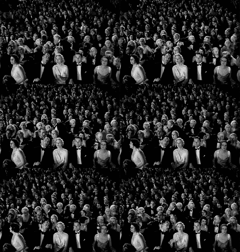
Movie Posters, much as they are today, began as a way to get potential audiences interested in upcoming feature films. Initially, they often depicted hand-drawn illustrations of scenes from the movie with little mentions of the stars. From there, slowly but surely, design aesthetics changed and WHO was in the movie became just as much of a selling point as WHAT the movie was about. Illustrations were eventually substituted by real-life photographs and the designs began to find more creative ways and styles with which to display their titles. From wild fonts to interesting placement, creativity fought to draw crowds towards the next big blockbuster.

One-Sheet (27 by 40 inches, or 686 by 1016 mm)—this is the size used to promote movies in theaters. One-sheets have an aspect ratio of slightly more than 2:3, or a width that’s 67.5% of the height.
What Is a Standard Movie Poster Size?
All movie posters usually contain the title, star(s), director, and release date, and some may also feature review quotes or slogans to further entice cinema-goers. Poster design using eye-catching colors, intricate typography, and exciting graphics plays a huge role in ensuring the success of the movie marketing campaign.
What Do All Movie Posters Have in Common?
There’s no single recommended program for creating a movie poster, but programs like Adobe Photoshop or Affinity Photo are best for photo-dominant designs. Publishing softwares like Adobe InDesign or Affinity Publisher give you more balanced control over both typography and images as well as allow you to easily adapt your poster design to different page sizes.
What Software Do You Need to Create a Movie Poster?
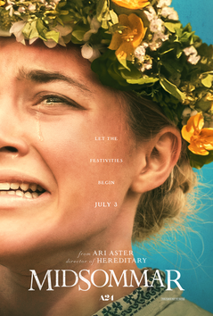
Midsommar (2019), A24
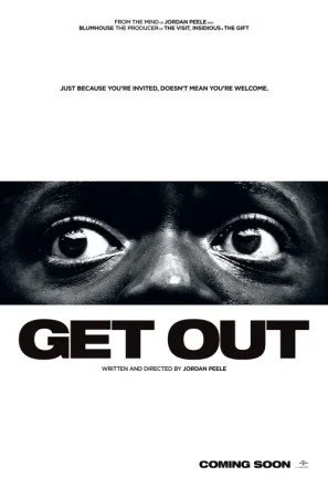
Get Out (2017), Universal Pictures
The horror genre has produced some of the most iconic movie poster designs of all time, from Ridley Scott’s Alien (1979) to Stanley Kubrick’s The Shining (1980). Perhaps this is because horror-themed posters are often extremely memorable and impactful
Gory references like blood and weaponry or spooky settings are common for the horror genre, but silhouetted figures and ghostly shapes in doorways or windows also help to reinforce the mysterious effect.
Dark, moody color palettes which use predominantly black or gray to conjure up a night-time setting can contrast strikingly with white or blood-red text, while fonts that suggest context or crime, such as period-type styles or bloodied lettering will really set the horror tone.
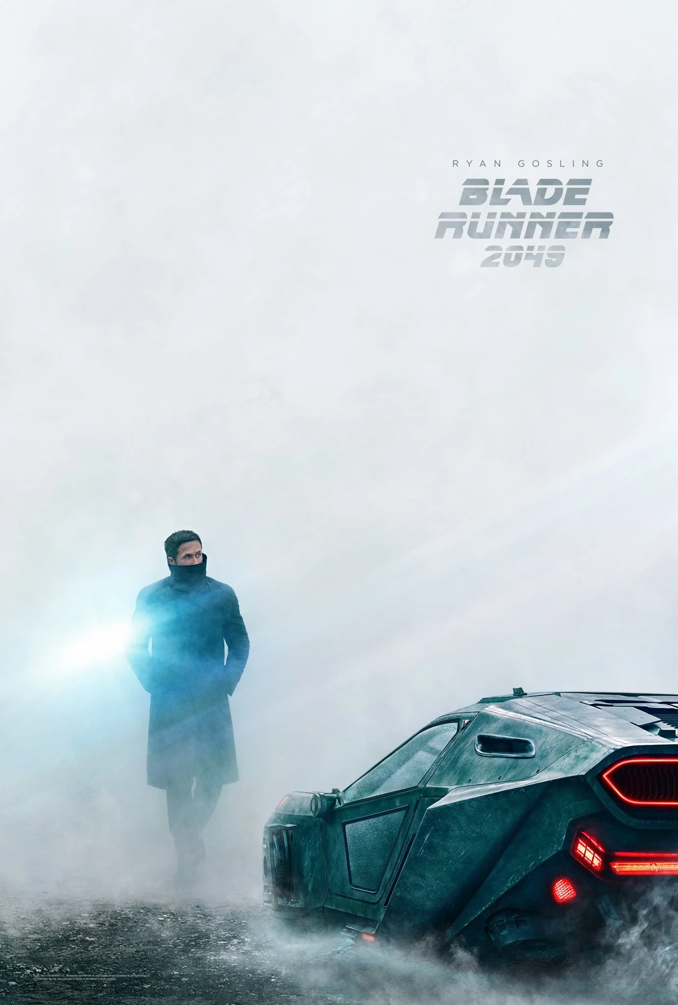
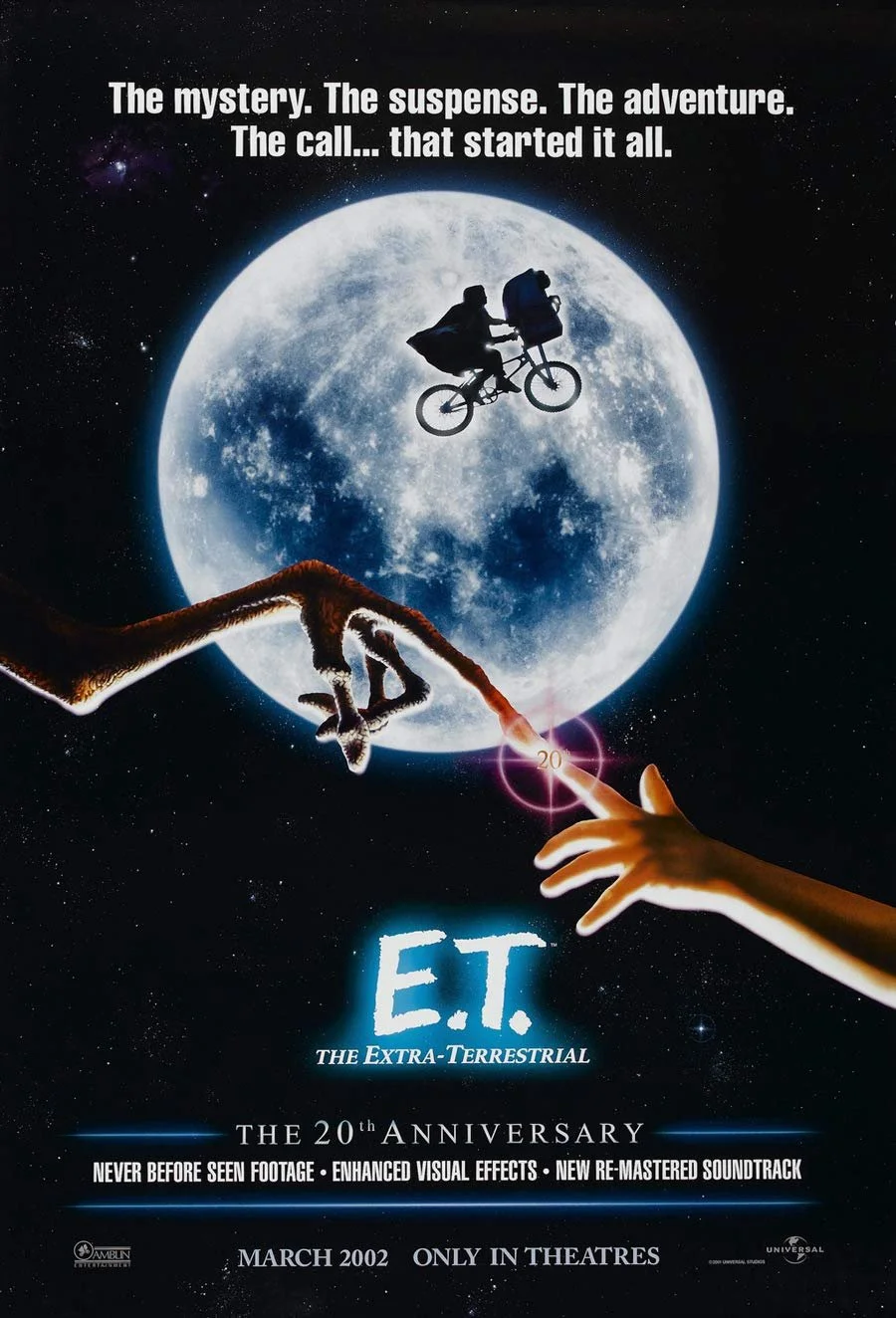
To fully channel the sci-fi genre in your poster designs, designers look to neon color palettes teamed with inky blacks and blues, space or planetary backgrounds, and robotic-inspired graphics.
Fonts such as sans serif or Futura can give an airy, ethereal feel to titling for space-set movies.
There is also experimentation with glow and other light effects to create atmospheric lighting which imitates the luminosity of machinery or stars.
Blade Runner 2049 (2017), Warners Bro. Pictures
E.T (1982), Universal Pictures
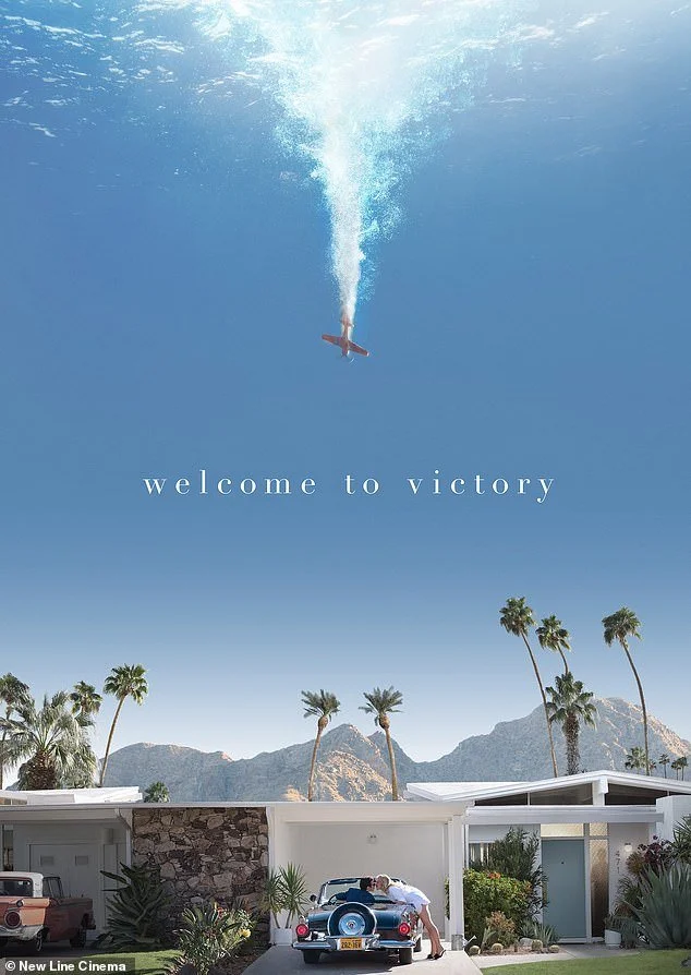
Don’t Worry Darling (2022), Warner Bros. Pictures
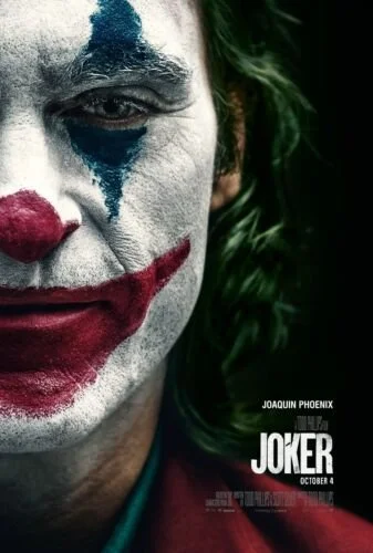
Joker (2019), Warner Bro. Pictures
Movie posters for action and thriller flicks are all about replicating the feeling of rushing adrenalin. You can create a sense of urgency and energy by focusing on the impact of movement and color in your poster design.
It may be a cliche, but red is often used as it's the color of energy and passion, and paired with images that give the feeling of movement and dynamism, the design feels immersive.
Textured, haphazard fonts or condensed type styles will also help to reinforce the feeling of gritty, hard-hitting action.
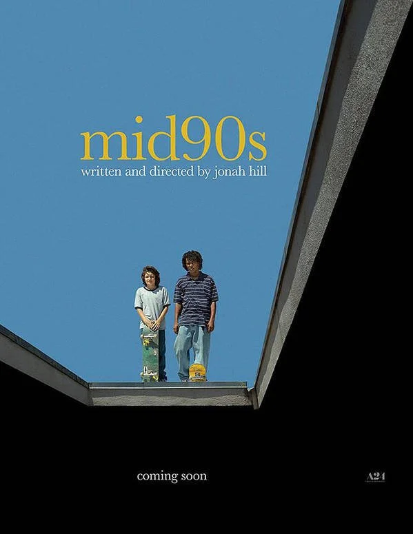
Mid90s (2018), A24
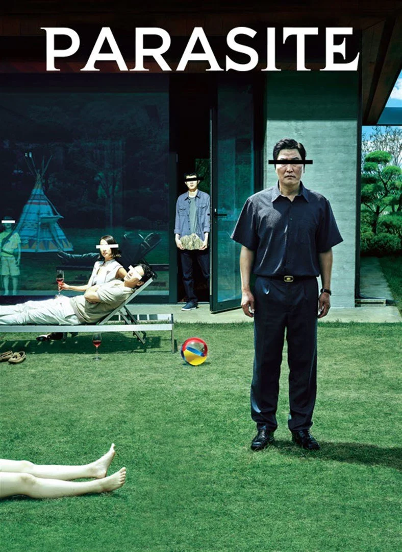
Parasite (2019), Barunson
Drama movies tend to have a serious, theatrical tone that is focused on the emotional interactions of the characters. The genre is very diverse, with movies set across a wide variety of settings and periods.
Designing a poster for a drama movie is an exercise in recreating the emotional mood of the film as a 2D image, which might reference the cinematography or characters. Atmospheric designs can be achieved by using immersive, dramatic photography taken from a film still or emotional character portraits. In recent years, the drama genre has produced some really interesting and unique poster art examples through large-scale typography and beautiful war-themed film shots.
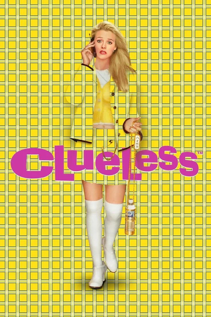
Clueless (1995), Paramount Pictures
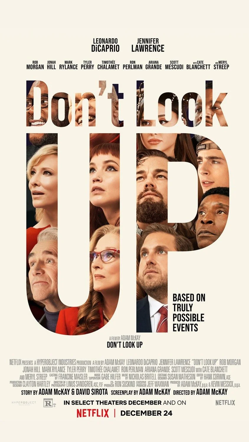
Don’t Look Up (2021), Netflix
Comedy audiences are looking for fun, laughter, and light-heartedness, and poster designers can channel this in their designs by using expressive photography and bright, optimistic color palettes.
Character photographs are often the focal point of comedy posters, with laughing or knowing facial expressions helping to give audiences a sense of the comedic mood of the film.
Bright, eye-popping colors on typography, graphics, and costumes can help a viewer feel optimistic about the movie. Pastel colors are still the standard for romantic comedies, while 1970s-inspired palettes of yellow and orange seem to be popular across the board.
Web Page Design by NEHA RAO

